Tuesday 19 February 2008

Wallcoverings Brief

I've been giving some consideration to the new brief and like the idea of a 'Conversational Print'. I'd like to approach it with the same method as in my other work - in that a series of illustrations/line drawings can be combined to produce a rhythmic print across a wallcovering.

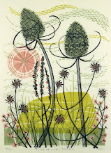
The above papers obviously directly relate to bird imagery, employing the use of line drawings and block silhouettes which I feel could be effectively combined. I love the Marimekko street scene below due to the approach to the actual drawing- it's loose, bold and energetic.

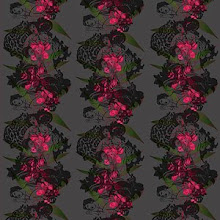
Jocelyn Warner - I came across her wallpapers through research and they've given me inspiration for the reinvention part of this project. She experiments with quality of line and scale, often using large scale floral imagery as the focus of her papers. I feel they're really effective. Her colour use also helps to ensure the impact isn't too great - for example a soft apple green as opposed to a bold, striking black line which may appear over dominant in a living space.

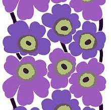
I like the large scale repeat of the tropical leaves within Cole and Son's paper and feel the use of different marks in the Marimekko print and the colour use make for an effective print.

www.nebopeklo.typepad.com

Whilst browsing on the internet I found a link to this website which is an online shop for some exquisite, delicate floral prints. I adore the freedom of the ink carefully dribbled and pooled on the page contrasted with a considered line drawing. The sensitive colour palette again compliments the works.

Monday 18 February 2008

Lucy Oldfield

I love these illustrations by Lucy Oldfield. She uses various objects as her subject matter, yet the results are beautiful. Her delicate drawings and often simple, carefully chosen colour palette are really effective.

Monday 4 February 2008

Deborah Bowness

I have just discovered Deborah Bowness' hand printed wallpapers . I'm impressed by their originality and her modern twist on the idea of wallcoverings through the use of photographic imagery. Book shelves, chandelliers and dresses have all been used to portray a sense of depth and an added layer within a room. She has been commissioned by designers such as Paul Smith, and for hotels such as 'Hotel du Petit Moulin' in Paris, indicating the sense of desire and appeal of her work.

Lizzie Allen

We've been given the new wallcoverings brief today. Whilst browsing through some wallpaper designers I discovered some beautiful, decorative, illustrative papers by Lizzie Allen. I particularly like her interesting colour palette. The lemon-yellows and apple-greens are effective against the black line drawings. She effectively manages to combine quirky illustrations with a good use of colour.